
What Do Your Logo Colors Mean?
Believe It Or Not: Logo Colors Have Meanings Behind Them
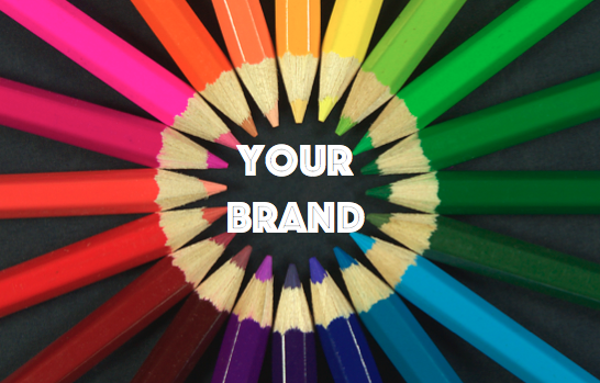
Logo Colors. They’re all around us. From basic complimentary colors to the hundreds of combinations they can create, colors come in an incredible variety if even with the subtlest changes. With all of these potential logo colors to choose from, it’s tough to determine which color is right for your company. Logos, and even more specifically the colors of your logo, set the tempo for your brand. It’s important to consider the messages that colors send subconsciously to your customers if you want to achieve a certain branding effect.
Immediately when a customer sees your logo or brand name displayed in all its glory, they will receive a general ‘feel’ for your company. Are you sleek and cunning, or wise and forgiving? Maybe you’re royal and majestic or earthy and modest. There are so many different ways for your company to be perceived, even just by the tint of color used in your logo. We did some research on general colors to investigate what logo colors mean to the naked eye and what types of messages they convey. Here’s what we found:
Blue 
The color of the sky and the ocean, blue is a dreamy and deep color. The short wavelengths of the color contradict red, which appears on the opposite end of the light spectrum. Not absorbed by light easily, it reflects back like the ocean, which is what gives it a ‘deep’ effect. Cool and calming, blue is an effective color to use when trying to convey comfortability. However, the deepness of it also conveys supreme wisdom and intellect. It’s a great color for representing air and water products, for something that can cool you down, or to be tranquil and serene. It’s also good for high-tech products due to its notion of intelligence.
Red
Red is an alertly fierce color that’s filled with energy. With long wavelengths, this color is absorbed easily and really confronts the human eye. It is easily detectable, denoting strength, passion, and desire. Its energy is great for attracting attention and being used for a cunning, aggressive company that wants to be seen as forceful. That’s why it’s used on common things like Stop signs, High Voltage signs, and spicy food warning labels. Use red when you want to grab someone’s attention and commit a quick decision. It’s lustful and cunning: good for sports, cars, and anything that involves speed, excitement, or seductive beauty.
Yellow
The third of the primary colors, yellow is an exciting and joyful expression. It’s seen in things such as the sun, flowers, and light in general. It is a bright and, at the same time, soothing color. Think of the way the sun looks through grey clouds on a beautiful day or how you can spot a taxi in a crowd of city cars. It’s the brightest primary color that brings joy and energy while provoking thought and attention. It’s loud, but fun. It’s also such a bright color that it’s unorthodox for many daily professional things, such as car colors (unless exotic) or business clothing. Instead, it’s great to give your logo some flare, attract eyes, and bring joy.
Green
Old trustworthy, green is an earthy tone that’s literally the color of nature. Its purity represents growth and an attachment to Earth. It’s great as a modest and honest color. It is not a prestigious color that denotes royalty, but rather the opposite, its attachment to the ground and everything natural. Related to blue logo colors, it shows some wisdom in its earthly message. With the amount of shades of green, one can convey an extremely outdoorsman color, dark green, as seen in camouflage or on pine trees, or an extremely light color like the flesh of a lime, which has more energy and flare to it. This green can be exciting, yet at the same time, calming and healthy. Use it for any eco-friendly products, if you want to be rejuvenating, or to promote harmony and health.
Orange
A bit less aggressive than red, orange is still a very energetic color. With mixtures of red and yellow, it contains powerful energy, but harnesses it, emitting some of the lighter joy that is associated with yellow as opposed to the aggression of red. So although it’s a hot color, it’s friendly and denotes creativity. Its uniqueness isn’t often seen in nature, so it has an element of rareness to it as well. Its more extreme shades of gold and brown emit royal and earthly vibrations respectively, showing the diversity that this color has. Generally though, it is one of the light-hearted logo colors that still holds a good amount of energy. Use this for more light-hearted branding if you still want it to grab attention fairly quickly.
Purple
A very rare color in nature, purple denotes something that is unique and mystical. Its very presence has a strange air to it, combining the calmness of blue with the excitement and cunningness of red. Its mixture is a dark, mysterious color. In ancient times, it was the hardest dye color to create, thus becoming the official color of all things royal. No one was permitted to use the color except for royalty and by force of its lack of availability and lawfulness, it became the color officially recognized as royalty. It’s to be used in bold scenarios or for a company that wants to emit elegance. When paired with gold, this duo of logo colors is essentially royal- almost untouchable on its regal pedestal.
Whatever color you go for, it’s important to consider these things. At the same time, whatever colors you like off the bat should be highly considered. However, always try many combinations and consider the type of vibe it gives your logo.